

Vector Illustration ARTS 532
- Brooke Kayla

- Mar 11, 2021
- 6 min read
Updated: Mar 12, 2021
This semester, I learned a lot about Illustrator. Before this course, I had never even opened the program. While I still have a lot to learn, I think I came a long way throughout the several weeks. It was not without its frustrations, but, when you learn something new, it can be frustrating.
Exercise 1: Flat VS. Skeuomorphic
The topic I chose to illustrate was an app on a smartphone. I brainstormed different ideas, and I was really in to the idea of making something that was so modern look vintage. As I was designing it, it had the effect I wanted on my parents who walked up behind me and would comment, “I had something like that when I was younger!” Of course, I didn’t really grow up with a tape recorder really, so I needed to draw out how I could not only make it look nostalgic, but also make it have all the modern essentials. The solution was to add modern buttons near the bottom, but also retro looking little nobs to add to the look.
Flat

Skeuomorphic


The tutorials informed my illustration decisions in learning how to use gradients and make it look believable. I not only read and looked at the tutorials, but I also was researching other tutorials on YouTube that also really helped me shade my flat design in a stylized way. Honestly, I learned a lot of stuff concerning Illustrator because I have never used it in my life. It was very difficult for me to think of so many sketches to do as well because when I have an idea, I usually make one or two sketches at the most. Not 20, ever. But, I was grateful because I found solutions to some of the little buttons that I didn’t like which I wouldn’t have done if I didn’t need to draw so many sketches. Learning how to use different tools, like the pen tool and the curvature tool, was interesting and helpful, but also frustrating when I couldn’t get it to do what I wanted. Then I learned about that tool that allows you to put shapes together and subtract different lines, which really helped.
Exercise 2: Illustrated Letterform
My chosen typeface was Cubano and the letterform I went with was the letter C. I sketched out many different ideas and liked the cute little cat that I did as my first sketch. I had in my head how I wanted it to look, almost realistic but with a cute little art style. I do not think my final represents what I wanted. Even though I watched and read all that I needed to according to the week, Illustrator just didn’t make enough sense to me. I have never in my life used this system, and after looking at the examples from class and comparing it to my own, I admit to feeling extremely discouraged and inadequate. I had hoped that mine could come out half as good as the examples, but I think I just need to continue to work hard at this new software..


The highlights and shadows were what I wanted to focus on, to make them fun and free form. The tutorials informed those decisions. But often times, I didn’t know where to put the highlights and the shadows. I saw that he said pick a light direction, so I did. But then I didn’t know how to make a furry shape. All the shapes I saw him do were smooth surfaces and shiny bits. It was extremely difficult for me to visualize what I wanted. I went through so many trials and errors before coming to this.
Exercise 3: Isometric Illustration
My chosen topic for illustration was architecture. I wanted to make a nice and simple little farmhouse that reminded me of one of my favorite stories, Anne of Green Gables. My pallet was very soft and had a lot of greens, pale browns, and whites. I wanted to make it look really cute so I did a lot of detail on railings, flowers, and a little hanging plant. Originally I wanted to make the house look like it was on a floating island, but instead I devoted that time to the details of the house and the fence around it. The whole tutorial informed my illustration decisions. It made sense to me to create things in a 2D sense and then have prerecorded actions that rotated and shifted those drawings to be set in a 3D perspective.
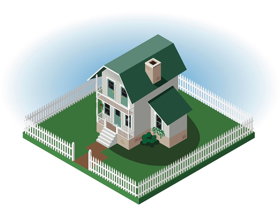
It was extremely time consuming. It was meticulous work to try and shade all the little details, and for once I am proud of my work. I worked extremely hard on it and found that this project made sense to me. The hardest part was figuring out all the 2D elements that make up a shape. Sometimes I found that I was missing elements which then caused me to go back and eyeball different details. Another very difficult part was the roof. I understood cubes and how to make them look and how to shade them. But a slanted roof was really weird to try and wrap my mind around. So, once again, I eyeballed it and I think it looks pretty believable.
Exercise 4: Monochromatic Illustration
My topic of illustration is landscape. I wanted to do some sort of mountain range and make my monochromatic palette blue. I sketched out multiple landscapes that I thought would peak my attention. Then, for my last sketch, I wanted to put some of these little characters of a nerdy little podcast that I like in the landscape. This then made me excited for my project and I needed to figure out the different tree textures, the different layers, and then my little characters.
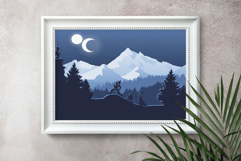

There were a few tutorials that informed my decisions. The style I was going for was very simple and I drew from the "Flat Illustration with Grain and Noise Texture". I really didn't want to have too many things have a lot of texture for what I was going for, but I also tried to incorporate at least one thing from the tutorials. The most difficult thing for me wasn't the landscape itself, or the textures, or even making the mountains look good with simple flat shadows; it was my characters' features. I had many trial and errors. I spent hours on just their features and I tried a bunch of different techniques, none of which worked for me. Then I needed to revert back to what I knew and paint on their little features with the brush. I'm sure there is an easier way to do it that I didn't find. But, after I was done, I was so proud of how they turned out.
Exercise 5: Illustrated Book Series
The topic I chose to illustrate was the book series “Outlander” by Diana Gabaldon. Even though I might have needed to skip over some parts in the first book that I read, and even some episodes in the popular television series, I fell in love with the characters and the story. I wanted to create simple illustrations that had a lot of texture and interest. After the monochromatic landscape that I created, I wanted to play around with textures even more. I created a few scatter brushes and figured out how to paint within the shapes I created. The style then turned out to be very textured and soft looking, even with the sharp edges of the shapes.


I definitely pulled from the texture tutorials that we were given in class. The most difficult part of this project was making the colors I wanted to use work together. I cycled through a lot of ideas, even after all of my sketches, before I settled on this style. I created different colored plaid patterns that I was really excited to use, but then when I actually used them, I didn’t like the look. I wanted the plaid to be used as the grass for the first two books and the water for the third. But it looked boring and busy all at the same time. I played around with different ideas before I landed. I picked one element to have in all the covers in order to unite them, and it was the sun. I changed the colors and the landscapes, but the style and the sun remained the same, which I think works.
Comments